
What are we going to build?
In this tutorial, we are going to build the “classic” dashboard layout, which consists of:
- header
- sidebar (or menu drawer) with toggle
- content area
- and footer
In the first part, we’ll develop this layout using “pure” React.js. In the second part - with the use of Material UI library.
Part I - Pure React.js
First, let’s create an HTML carcass of the layout.
function App() {
  return (
    <div className="App">
      <div className="header">Header</div>
      <div className="container">
        <aside className="drawer">Drawer</aside>
        <main className="main">Content</main>
      </div>
      <div className="footer">Footer</div>
    </div>
  );
}
Here we have the app container (App class name), which includes:
- the header
- the container with drawer and the main content area
- the footer
Now it’s time to add some styling.
.App {
  text-align: center;
  display: flex;
  flex-direction: column;
  min-height: 100vh;
  color: #000133;
}

.header,
.footer {
  background: #00022e;
  height: 50px;
  color: #fc86aa;
}

.container {
  display: flex;
  flex: 1;
}

.drawer {
  background: #d8dcd6;
  width: 240px;
}

.main {
  flex: 1;
  background: #f7f5f5;
}
The main aspects of the CSS code are:
- minimum height of the app container equals window height (100 vh)
- the header and the footer have fixed height (50 px)
- the container takes all available window size (flex: 1) besides parts that were taken by the elements with the fixed height (the header and the footer)
- the drawer has a fixed width (240 px)
- the main (or content) area also takes all available space (flex: 1)
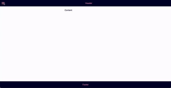
The layout looks like this so far:

Drawer toggler
The only thing is left to add is the ability to toggle the drawer. To achieve this we need to:
- keep track of the drawer state: is it opened or closed
- depending on its state change the width of the drawer (0px - when closed, 240 px - when opened)
- toggle menu icon in the header section
To store and update the drawer’s state we are going to use the useState hook. The initial state of the drawer is closed.
const [isOpened, setIsOpened] = useState(false);If the drawer is opened, then the opened class will be added to the drawer element. By default, the drawer class will be used in any case.
<aside className={`${isOpened ? "opened" : ""} drawer`}>Drawer</aside>As the initial drawer state is closed, so initial drawer width should be 0. Plus let’s add the CSS transition property for smooth animation.
.drawer {
  background: #d8dcd6;
  width: 0px;
  transition: width 0.7s;
}

.opened {
  width: 240px;
}
To be able to toggle the drawer we need to add the menu icon to the header bar. By clicking on this icon the drawer should become visible and the icon should be changed from menu icon to arrow icon.
As we’re going to use the Material-UI library in the second part of this blog post, I’m using the Menu and the ChevronLeftIcon from “@material-ui/icons” package. But you are free to use whatever icons you prefer.
import MenuIcon from "@material-ui/icons/Menu";
import ChevronLeftIcon from "@material-ui/icons/ChevronLeft";

...
 <div className="header">
  <div className="icon" onClick={() => setIsOpened(!isOpened)}>
    {isOpened ? <ChevronLeftIcon /> : <MenuIcon />}
  </div>
  <div className="header-title">Header</div>
</div>
...
For the header and the icon to look nice, let’s update the styles:
.header,
.footer {
display: flex;
background: #00022e;
height: 50px;
align-items: center;
justify-content: center;
color: #fc86aa;
}
.icon {
padding: 10px;
}
.icon:hover {
cursor: pointer;
}
.header-title {
margin: auto;
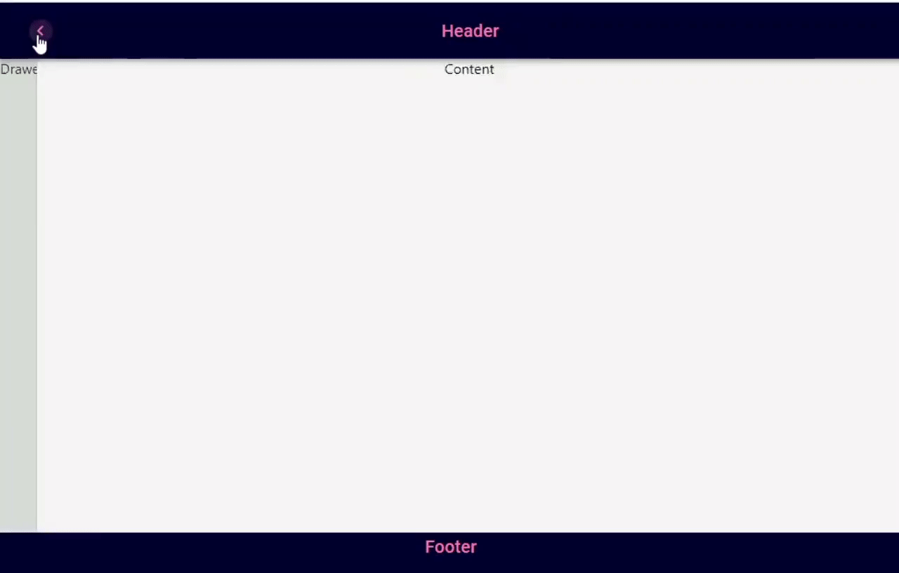
}And the result is:
The full code is here.
Part II - Material UI
Oficial Material UI docs have several examples with different drawer options, such as:
Using these examples as a starting point, we aim to build a different layout.
Let’s start to add building blocks to our layout.
As for the Header element we’ll use a combination of AppBar and Toolbar Material UI components. For the Drawer, we are obviously going to use the Drawer component. All texts will be wrapped into the Typography component.
<div>
  <AppBar>
    <Toolbar>
      <Typography>Header</Typography>
    </Toolbar>
  </AppBar>
  <div>
    <Drawer>Drawer</Drawer>
    <main>Content</main>
  </div>
  <div>
    <Typography>Footer</Typography>
  </div>
</div>
Without styling, it looks far from what we want to achieve. Let’s add styles! I prefer to use Hook API Material UI styling solution.
JSX part of the component:
import { makeStyles } from "@material-ui/core/styles";
import Drawer from "@material-ui/core/Drawer";
import AppBar from "@material-ui/core/AppBar";
import Toolbar from "@material-ui/core/Toolbar";
import Typography from "@material-ui/core/Typography";
import { styles } from "./material-ui.styles";

const useStyles = makeStyles(styles);

const MaterialUI = () => {
  const classes = useStyles();
  return (
    <div className={classes.root}>
      <AppBar className={classes.appBar}>
        <Toolbar>
          <Typography>Header</Typography>
        </Toolbar>
      </AppBar>
      {/* empty Toolbar */}
      <Toolbar />
      <div className={classes.container}>
        <Drawer
          variant="permanent"
          {/* overriding default styles */}
          classes={{
            paper: classes.drawer,
          }}
        >
          Drawer
        </Drawer>
        <main className={classes.main}>Content</main>
      </div>
      <div className={classes.footer}>
        <Typography>Footer</Typography>
      </div>
    </div>
  );
};
Styles:
export const styles = () => ({
  root: {
    textAlign: "center",
    display: "flex",
    flexDirection: "column",
    minHeight: "100vh",
    color: "#000133",
  },
  appBar: {
    background: "#00022E",
    color: "#FC86AA",
  },
  container: {
    display: "flex",
    flex: 1,
  },
  drawer: {
    background: "#D8DCD6",
    width: "240px",
    position: "static",
  },
  main: {
    flex: 1,
    background: "#f7f5f5",
    color: "black",
  },
  footer: {
    background: "#00022E",
    height: "50px",
    color: "#FC86AA",
  },
});
Here we have two tricky moments:
- For the Drawer to look exactly the way we want, we have to override its default styles.
- As the AppBar z-index by default is 1100, it is positioned above all other content, thus the top part of the drawer and the main content area are hidden behind the AppBar. One way to solve this problem is to add an empty Toolbar component that has a default height right before the parent div element of the Drawer and main content.
Current layout:

Now let’s add the Drawer toggler.
The steps for achieving this are the same as described in the first part of the blog post.
So, the final code is:
import { useState } from "react";
import { makeStyles } from "@material-ui/core/styles";
import clsx from "clsx";
import Drawer from "@material-ui/core/Drawer";
import AppBar from "@material-ui/core/AppBar";
import Toolbar from "@material-ui/core/Toolbar";
import Typography from "@material-ui/core/Typography";
import IconButton from "@material-ui/core/IconButton";
import MenuIcon from "@material-ui/icons/Menu";
import ChevronLeftIcon from "@material-ui/icons/ChevronLeft";
import { styles } from "./post.styles";

const useStyles = makeStyles(styles);

const MaterialUI = () => {
  const classes = useStyles();
  const [isOpened, setIsOpened] = useState(false);
  return (
    <div className={classes.root}>
      <AppBar className={classes.appBar}>
        <Toolbar>
          <IconButton
            color="inherit"
            onClick={() => setIsOpened(!isOpened)}
            className={classes.icon}
          >
            {isOpened ? <ChevronLeftIcon /> : <MenuIcon />}
          </IconButton>
          <Typography variant="h6" className={classes.title}>
            Header
          </Typography>
        </Toolbar>
      </AppBar>
      <Toolbar />
      <div className={classes.container}>
        <Drawer
          variant="permanent"
          classes={{
            paper: clsx(classes.drawer, {
              [classes.closed]: !isOpened,
              [classes.opened]: isOpened,
            }),
          }}
        >
          Drawer
        </Drawer>
        <main className={classes.main}>Content</main>
      </div>
      <div className={classes.footer}>
        <Typography variant="h6">Footer</Typography>
      </div>
    </div>
  );
};
Styles:
export const styles = () => ({
  root: {
    textAlign: "center",
    display: "flex",
    flexDirection: "column",
    minHeight: "100vh",
    color: "#000133",
  },
  appBar: {
    background: "#00022E",
    color: "#FC86AA",
  },
  icon: {
    padding: "10px",
  },
  title: {
    margin: "auto",
  },
  container: {
    display: "flex",
    flex: 1,
  },
  drawer: {
    background: "#D8DCD6",
    position: "static",
    transition: "width .7s",
  },
  closed: {
    width: "0px",
  },
  opened: {
    width: "240px",
  },
  main: {
    flex: 1,
    background: "#f7f5f5",
    color: "black",
  },
  footer: {
    background: "#00022E",
    height: "50px",
    color: "#FC86AA",
  },
});
For constructing className strings of the Drawer component conditionally the clsx utility is used.
And here is the custom Material UI Dashboard layout:
Conclusion
Using the above-described technique, I’ve created a more advanced template with:
- TypeScript
- React Router
- React Context
- Responsive design
This template is available in this GitHub repo.