Next.js Dashboard layout with TypeScript and Styled components
How to create a classic Dashboard layout that includes a header, footer, menu drawer (sidebar) with toggle, multilevel nested menu and content using Next.js, TypeScript and Styled component.

Introduction
Dashboards! I love dashboards! It's my development passion! The majority of the projects that I've been involved with during my tech career revolve around dashboards. At the moment of writing this blog post, I work as a freelancer on two dashboard-y projects.
The solid groundwork for the dashboard project is crucial. The usage of the basic layout template can save hours (if not days) of development work. Previously this year, I developed the dashboard layout using React.js and Material UI.
Over this year, Next.js has gained more and more popularity. It's a fantastic framework, and I love working on the Next.js projects. So I've decided to extract the part of the code from one of my projects (with modifications) and create a classic dashboard layout template, e.g., a starter for future Next.js dashboard projects.
Here is how the final result looks like:
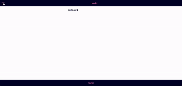
Features
- Basic layout: header, the main content area with drawer, footer
- Drawer toggle
- Multilevel (nested) menu
Technologies used
- Next.js v.12
- TypeScript v.4
- Styled Components v.5
- Styled Icons (Material) v.10
1. Initialize Next.js project
We will use TypeScript in this project, so let's start with the Next.js TypeScript template. Run
npx create-next-app@latest --typescript
For styling let's use styled-components library:
npm i styled-components
And as we are using TypeScipt, we also need to add styled-components types as a dev dependency:
npm i -D @types/styled-components
The last dependency that we need for this template is styled-icons, more precisely - materials icon pack:
npm i @styled-icons/material
1a. Nextjs and styled-components setup
The styled-components support server-side rendering. To enable stylesheet rehydration, we need to add a custom pages/_document.js file as per the official Next.js example with some TypeScript tweak:
//pages/_document.tsx

import Document, { DocumentContext } from "next/document";
import { ServerStyleSheet } from "styled-components";

export default class MyDocument extends Document {
  static async getInitialProps(ctx: DocumentContext) {
    const sheet = new ServerStyleSheet();
    const originalRenderPage = ctx.renderPage;

    try {
      ctx.renderPage = () =>
        originalRenderPage({
          enhanceApp: (App) => (props) =>
            sheet.collectStyles(<App {...props} />),
        });

      const initialProps = await Document.getInitialProps(ctx);
      return {
        ...initialProps,
        styles: (
          <>
            {initialProps.styles}
            {sheet.getStyleElement()}
          </>
        ),
      };
    } finally {
      sheet.seal();
    }
  }
}
2. General layout
As we have only one layout for the entire app, we will create the DashboardLayout component and then wrap the whole app (pages/_app.tsx) with this layout.
//components/DashboardLayout/index.tsx

type DashboardLayoutProps = {
  children: React.ReactNode,
};

export default function DashboardLayout({ children }: DashboardLayoutProps) {
  return (
    <Container>
      <Header />
      <Content>
        <Sidebar />
        <PageContainer>{children}</PageContainer>
      </Content>
      <Footer />
    </Container>
  );
}
Basically, it's a blueprint of the layout. Now let's add some styled-components magic.
//components/DashboardLayout/styles.ts

import styled from "styled-components";

export const Container = styled.div`
  text-align: center;
  display: flex;
  flex-direction: column;
  min-height: 100vh;
  color: #000133;
`;

export const Content = styled.div`
  display: flex;
  flex: 1;
`;

export const PageContainer = styled.div`
  padding: 20px;
  width: 80vw;
`;
The Header component:
//components/Header/index.tsx

import { HeaderContainer, TitleContainer } from "./styles";

export default function Header() {
  return (
    <HeaderContainer>
      <TitleContainer>Header</TitleContainer>
    </HeaderContainer>
  );
}
Header styles:
//components/Header/styles.ts

import styled from "styled-components";

export const HeaderContainer = styled.header`
  display: flex;
  background: #00022e;
  height: 50px;
  align-items: center;
  justify-content: center;
  color: #fc86aa;
`;

export const TitleContainer = styled.div`
  margin: auto;
`;
The Footer component:
//components/Footer/index.tsx

import { FooterContainer } from "./Footer.styles";

export default function Footer() {
  return <FooterContainer>Footer</FooterContainer>;
}
Footer styles:
//components/Footer/styles.ts

import styled from "styled-components";

export const FooterContainer = styled.footer`
  display: flex;
  background: #00022e;
  height: 50px;
  align-items: center;
  justify-content: center;
  color: #fc86aa;
`;
And the Sidebar component:
// components/Sidebar/index.tsx

import { SidebarContainer } from "./styles";

export default function Sidebar() {
  return <SidebarContainer>Menu</SidebarContainer>;
}
Sidebar styles:
// components/Sidebar/styles.ts

import styled from "styled-components";

export const SidebarContainer = styled.aside`
  background: #d8dcd6;
  width: 20vw;
`;
The key points of the CSS code above are:
- minimum height of the app container equals window height (100 vh)
- the header and the footer have fixed height (50 px)
- the content takes all available window size (flex: 1) besides parts that were taken by the elements with the fixed height (the header and the footer)
- the sidebar has a fixed width (20 vw)
Now wrap all the app in DashboardLayout component:
// pages/_app.tsx

import "../styles/globals.css";
import type { AppProps } from "next/app";
import DashboardLayout from "../components/DashboardLayout";

function MyApp({ Component, pageProps }: AppProps) {
  return (
    <DashboardLayout>
      <Component {...pageProps} />
    </DashboardLayout>
  );
}

export default MyApp;
Clear all the demo code in pages/index.tsx file and add only:
//pages/index.tsx

import type { NextPage } from "next";

const Home: NextPage = () => {
  return <div>Content</div>;
};

export default Home;
Run the project:
npm run dev
Currently the layout looks like this:
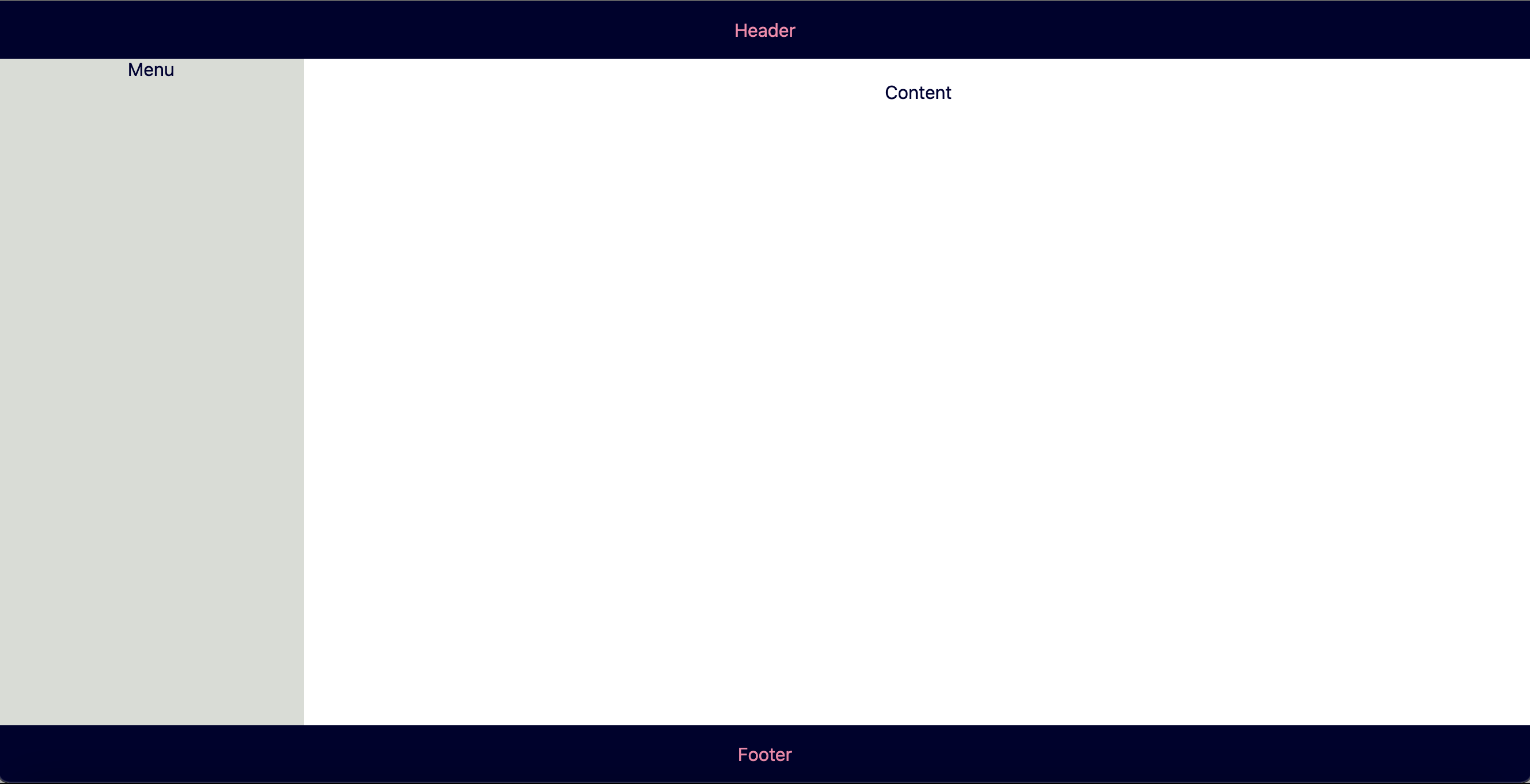
3. Drawer toggle
It's time to add the menu (drawer) toggle. In order to implement this, we need:
- keep track of the drawer state: is it opened or closed
- depending on its state, change the width of the drawer (0vw - when closed, 20vw - when opened)
- toggle menu icon in the header section
To store and update the drawer's state, we are going to use the useState hook. As both the Header and the Sidebar components need to be aware of the state, we'll put the shared state into the parent component (DashboardLayout) and pass it as a prop to the Header and the Sidebar components.
Plus, we need to be able to toggle the drawer (open or close) by clicking on the icon in the Header component. Thus the state setter (setOpened) should be passed as a prop to the Header component.
//components/DashboardLayout/index.tsx

...

import { useState } from "react";

type DashboardLayoutProps = {
  children: React.ReactNode;
};

export default function DashboardLayout({ children }: DashboardLayoutProps) {
  const [isOpened, setOpened] = useState(false);

  const toggleDrawer = () => {
    setOpened((prev) => !prev);
  };

  return (
    <Container>
      <Header isOpened={isOpened} toggleDrawer={toggleDrawer} />
      <Content>
        <Sidebar isOpened={isOpened} />
        <PageContainer>{children}</PageContainer>
      </Content>
      <Footer />
    </Container>
  );
}
The Header component should have the icon button to open or close the drawer. The icon itself should be different depending on the drawer state.
//components/Header/index.tsx

import { HeaderContainer, TitleContainer, IconContainer } from "./styles";
import { Menu, ChevronLeft } from "@styled-icons/material";

type HeaderProps = {
  isOpened: boolean,
  toggleDrawer: () => void,
};

export default function Header({ isOpened, toggleDrawer }: HeaderProps) {
  return (
    <HeaderContainer>
      <IconContainer onClick={toggleDrawer}>
        {isOpened ? <ChevronLeft /> : <Menu />}
      </IconContainer>
      <TitleContainer>Header</TitleContainer>
    </HeaderContainer>
  );
}
IconContainer styles:
// components/Header/styles.ts

...

export const IconContainer = styled.div`
  padding: 10px;
  cursor: pointer;

  & svg {
    height: 30px;
  }
`;
Each drawer state change should update the Sidebar component's styles, e.g., to change its width. To achieve this, we need to pass the isOpened prop to the SidebarContainer styled component.
//components/Sidebar/index.tsx

import { SidebarContainer } from "./styles";

type SidebarProps = {
  isOpened: boolean;
};

export default function Sidebar({ isOpened }: SidebarProps) {
  return <SidebarContainer isOpened={isOpened}>Menu</SidebarContainer>;
Consume isOpened prop in the styles:
// components/Sidebar/styles.ts`

...

export const SidebarContainer = styled.aside<{ isOpened: boolean }>`
  background: #d8dcd6;
  width: ${(props) => (props.isOpened ? "20vw" : "0vw")};
  transition: width 0.5s;
  overflow: hidden;
`;
Check how the layout looks like in the browser:
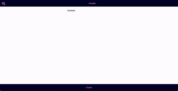
4. Multilevel menu
Each dashboard should have navigation. Let's move to the implementation of the multilevel nested menu.
A typical menu option should have the following props:
- name
- icon
- URL (or path)
- sub menu items - if this menu option should have nested options
In 99% of cases, we know all menu items upfront. It means that we can use them as constants.
//constants/menu-items.ts

import {
  Dashboard,
  ShoppingCart,
  People,
  AttachMoney,
  AddShoppingCart,
  Done,
  Business,
  HomeWork,
  Person,
} from "@styled-icons/material";

type MenuOption = {
  name: string,
  icon: React.ComponentType,
  url: string,
  subItems?: MenuOption[],
};

const MENU_OPTIONS: MenuOption[] = [
  {
    name: "Dashboard",
    icon: Dashboard,
    url: "/",
  },
  {
    name: "Orders",
    icon: ShoppingCart,
    url: "/orders",
    subItems: [
      {
        name: "New",
        icon: AddShoppingCart,
        url: "/new-orders",
      },
      {
        name: "Completed",
        icon: Done,
        url: "/completed-orders",
      },
    ],
  },
  {
    name: "Customers",
    icon: People,
    url: "/customers",
    subItems: [
      {
        name: "Corporate",
        icon: Business,
        url: "/corporate",
      },
      {
        name: "SMB",
        icon: HomeWork,
        url: "/smb",
        subItems: [
          {
            name: "Retail",
            icon: Person,
            url: "/retail",
          },
        ],
      },
    ],
  },
  {
    name: "Inventory",
    icon: AttachMoney,
    url: "/inventory",
  },
];
To render each menu item (including sub-items) with the appropriate style (e.g., margin-left) and know if this particular menu item is the parent item, let's add another additional prop to each menu item - depth. Also, as we later be mapping over menu items and each child component in React should have the key prop, we should add the id prop to each menu item.
We will use the recursive function for this:
//constants/menu-items.ts

...

export type MenuItem = {
  name: string,
  icon: React.ComponentType,
  url: string,
  id: string,
  depth: number,
  subItems?: MenuItem[],
};

function makeMenuLevel(options: MenuOption[], depth = 0): MenuItem[] {
  return options.map((option, idx) => ({
    ...option,
    id: depth === 0 ? idx.toString() : `${depth}.${idx}`,
    depth,
    subItems:
      option.subItems && option.subItems.length > 0
        ? makeMenuLevel(option.subItems, depth + 1)
        : undefined,
  }));
}

export const MENU_ITEMS: MenuItem[] = makeMenuLevel(MENU_OPTIONS);
So, the makeMenuLevel function takes an array of previously created menu options and a depth with the initial value equals zero as arguments. Inside this function, we map over the array of option items and return the new option object with two additional props:
- id
- depth
And then call this function recursively again to implement the same logic for the subItems array increasing the depth by 1.
Now let's render the menu items.
// components/Sidebar/index.tsx

import { SidebarContainer } from "./styles";
import { MENU_ITEMS } from "../../constants/menu-items";
import MenuItemsList from "../MenuItemsList";

type SidebarProps = {
  isOpened: boolean,
};

export default function Sidebar({ isOpened }: SidebarProps) {
  return (
    <SidebarContainer isOpened={isOpened}>
      <MenuItemsList options={MENU_ITEMS} />
    </SidebarContainer>
  );
}
Add new MenuItemsList, MenuItem and ExpandIcon components:
//components/MenuItemsList/index.tsx

import { MenuItem as MenuItemType } from "../../constants/menu-items";
import MenuItem from "../MenuItem";

type MenuItemsListProps = {
  options: MenuItemType[],
};

export default function MenuItemsList({ options }: MenuItemsListProps) {
  return (
    <>
      {options.map((option) => (
        <MenuItem menuItem={option} key={option.id} />
      ))}
    </>
  );
}
//components/MenuItem/index.tsx

import Link from "next/link";
import { useRouter } from "next/router";
import { MenuItem as MenuItemType } from "../../constants/menu-items";
import { MenuItemContainer } from "./styles";
import MenuItemsList from "../MenuItemsList";
import ExpandIcon from "../ExpandIcon";
import { useState } from "react";

type MenuItemProps = {
  menuItem: MenuItemType,
};

export default function MenuItem({
  menuItem: { name, icon: Icon, url, depth, subItems },
}: MenuItemProps) {
  const [isExpanded, toggleExpanded] = useState(false);

  const router = useRouter();
  const selected = router.asPath === url;
  const isNested = subItems && subItems?.length > 0;

  const onClick = () => {
    toggleExpanded((prev) => !prev);
  };

  return (
    <>
      <MenuItemContainer className={selected ? "selected" : ""} depth={depth}>
        <Link href={url} passHref>
          <div className="menu-item">
            <Icon />
            <span>{name}</span>
          </div>
        </Link>
        {isNested ? (
          <ExpandIcon isExpanded={isExpanded} handleClick={onClick} />
        ) : null}
      </MenuItemContainer>
      {isExpanded && isNested ? <MenuItemsList options={subItems} /> : null}
    </>
  );
}
The MenuItem styles:
//components/MenuItem/styles.ts

import styled from "styled-components";

export const MenuItemContainer =
  styled.a <
  { depth: number } >
  `
  display: flex;
  flex-direction: row;
  font-size: 20px;
  padding: 10px 0px 10px 10px;
  align-items: center;
  justify-content: space-between;

  & svg {
    height: 30px;
    margin-right: 10px;
  }

  &:hover {
    background-color: #00022e;
    color: #fc86aa;
    opacity: 0.5;
    cursor: pointer;
  }

  .menu-item {
    display: flex;
    flex-direction: row;
    align-items: center;
    margin-left: ${({ depth }) => `${depth}rem`};
  }

  &.selected {
    background-color: #00022e;
    color: #fff;
  }
`;
//components/ExpandIcon/index.tsx

import { ExpandMore, ExpandLess } from "@styled-icons/material";

type ExpandIconPros = {
  isExpanded: boolean,
  handleClick: () => void,
};

export default function ExpandIcon({
  isExpanded,
  handleClick,
}: ExpandIconPros) {
  return isExpanded ? (
    <ExpandLess onClick={handleClick} />
  ) : (
    <ExpandMore onClick={handleClick} />
  );
}
The main logic happens in the MenuItem component:
- to define whether this menu item is currently active (selected), we check if the item's url prop is equal to the current path with the help of the next/router
- the isNested variable defines if the menu item has sub-items
- if yes, then the ExpandIcon component is rendered
- by clicking on the ExpandIcon we change the isExpanded state. If isExpanded is equal to true, we recursively render the MenuItemsList component passing the subItems array as a prop.
It's straightforward to define navigation in Next.js. Every file name in the page directory is associated with the respective route.
So, for example, to create a placeholder for the orders page in our layout, just add the orders.tsx file in the pages directory:
// pages/orders.tsx

import type { NextPage } from "next";

const Orders: NextPage = () => {
  return <div>Orders</div>;
};

export default Orders;
Then repeat this procedure for all other pages.
And that's it! The final result is:
Conclusion
The complete code (with some extra bonuses) is available in this GitHub repo.