React: How to create a custom progress bar component in 5 minutes
How to create a custom progress bar component in 5 minutes from scratch with animation
A couple of days ago, while working on one of React projects with the use of a very popular UI library, I’ve stumbled upon a problem: I needed to make some style changes of the Progress Bar component. But after struggling with it for a few hours and being in a complete desperation (why isn’t it working as it is written in the documentation???), I’ve decided to create a Progress Bar component from scratch. Here how I’ve made it.
1. Create a progress-bar.component.js file
import React from "react";

const ProgressBar = (props) => {
  const { bgcolor, completed } = props;
  return (
    <div>
      <div>
        <span>{`${completed}%`}</span>
      </div>
    </div>
  );
};

export default ProgressBar;
Basically, the component consists of two parts:
- the main parent div container - represents the whole bar
- the child div - completed part of the bar with the span which will show the completed percentage number.
Our custom progress bar component will receive just two props:
- bgcolor - background color of the completed part of the bar
- completed - number between 0 and 100
2. Add styling
Just for the sake of this tutorial, for styling, I’m going to use pure inline CSS. Another option would be to use the styled-components library, but let’s keep it simple.
const ProgressBar = (props) => {
  const { bgcolor, completed } = props;

  const containerStyles = {
    height: 20,
    width: "100%",
    backgroundColor: "#e0e0de",
    borderRadius: 50,
    margin: 50,
  };

  const fillerStyles = {
    height: "100%",
    width: `${completed}%`,
    backgroundColor: bgcolor,
    borderRadius: "inherit",
    textAlign: "right",
  };

  const labelStyles = {
    padding: 5,
    color: "white",
    fontWeight: "bold",
  };

  return (
    <div style={containerStyles}>
      <div style={fillerStyles}>
        <span style={labelStyles}>{`${completed}%`}</span>
      </div>
    </div>
  );
};

export default ProgressBar;
Nothing fancy. Mostly background colors and a border-radius.
Let’s test what we’ve developed.
import React from "react";
import "./App.css";
import ProgressBar from "./progress-bar.component";
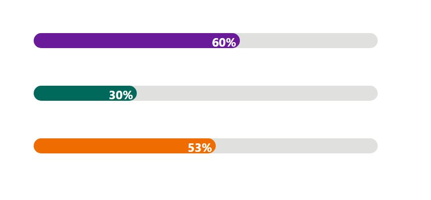
const testData = [
{ bgcolor: "#6a1b9a", completed: 60 },
{ bgcolor: "#00695c", completed: 30 },
{ bgcolor: "#ef6c00", completed: 53 },
];
function App() {
return (
<div className="App">
{testData.map((item, idx) => (
<ProgressBar
key={idx}
bgcolor={item.bgcolor}
completed={item.completed}
/>
))}
</div>
);
}
export default App;
Run the app and check what we’ve got in the browser.
And that’s it! The simple Progress Bar React component is ready!
BONUS. Adding animation.
Well, actually, to animate the progress bar movement it is sufficient to add just one line into the fillerStyles:
const fillerStyles = {
    ...
    transition: 'width 1s ease-in-out',
    ...
  }
To demonstrate animation in action I’m going to create a function, which will randomly generate the completed prop value every 2 sec. This function will be place inside the useEffect hook.
function App() {
  const [completed, setCompleted] = useState(0);

  useEffect(() => {
    setInterval(() => setCompleted(Math.floor(Math.random() * 100) + 1), 2000);
  }, []);

  return (
    <div className="App">
      <ProgressBar bgcolor={"#6a1b9a"} completed={completed} />
    </div>
  );
}
And that's the final result:

Conclusion
And that’s it! In this short blog post, I’ve described a step-by-step process of creating a custom Progress Bar React component. This component is fully customizable, so you can add any additional styling and functionality depending on your project needs.
The complete source code of the component is available in this GitHub repository
Also, you can use this component (with TypeScript support) as npm package.